1 – Balance
Balance in design relates to how visual weight is distributed within a certain area. You can utilize symmetrical and asymmetrical balance in your floral arrangements.
A. Symmetrical equilibrium when the amount of material on all sides of the display is the same, such as in a typical triangle.
Asymmetrical balance, also known as an L-shape, is when materials are distributed unevenly on either side of the arrangement. It can be a more casual or contemporary design.
Open balance, on the other hand, is neither symmetrical nor asymmetrical. Used occasionally in patterns that feature radial or parallel groupings, such as the Biedermeier posy.
Contrast
Using opposite elements, in contrast, can add visual interest. Color contrast is the most typical sort of contrast utilized in floral design. You do this by combining two hues at the opposing extremes of the color wheel (e.g., red and green, blue and orange).
You can make your designs more visually appealing and eye-catching by incorporating contrasting elements! By using contrasting elements in your designs, you can create more visually interesting and eye-catching arrangements!
Proportion/Scale

Proportion and scale refer to the size of the elements (Flowers, Foliage, Containers and Accessories) in relation to each other and the overall design. The most important thing to keep in mind when working with proportion and scale is that the elements should be in proportion with each other (e.g., all the flowers are the same size). Everything has to look in proportion to each other and complement each other. A common mistakes would be using an extremely large container and designing a very small display in it.

Another thing to keep in mind is that the overall scale of the design should be appropriate for the space it’s going into This closely related to proportion, It is the relationship between the overall design and the setting for the design (table, Altar, Stands, venue etc)Pro tip: When working with proportion and scale, make sure to use odd numbers of elements (e.g., three flowers instead of four). This will help create a more pleasing and visually interesting design
Rhythm/Movement

The hierarchy of elements in a design is discussed in terms of dominance and subordination. In other words, it’s the sequence in which the various design components catch your attention. You can impose dominance and subordination in your designs in one of two ways:
Size – In this case, larger pieces are used to emphasize a particular section of the design while smaller elements play a supporting role.
Color – In this case, lighter hues are used to highlight a particular portion of the design while darker hues blend into the background.
Harmony

Unity and harmony refer to the way all the elements in the design work together to create a sense of cohesion. In other words, unity and harmony are about creating a design that is pleasing to the eye and easy to understand.
You can create unity and harmony in your designs by using similar colors, shapes, and/or textures throughout the design. You can also use repetition and rhythm to create unity and harmony.
Variety

Variety and interestingness refer to how the design is aesthetically appealing and visually engaging. By including a wide range of various features, you may add diversity and interest to your designs (e.g., different colors, sizes, and textures). To make your designs more interesting, you may also incorporate contrast, rhythm, and movement. Using a range of various elements can help you to add diversity and interest to your designs. This will keep the design interesting and pleasing to the eye.
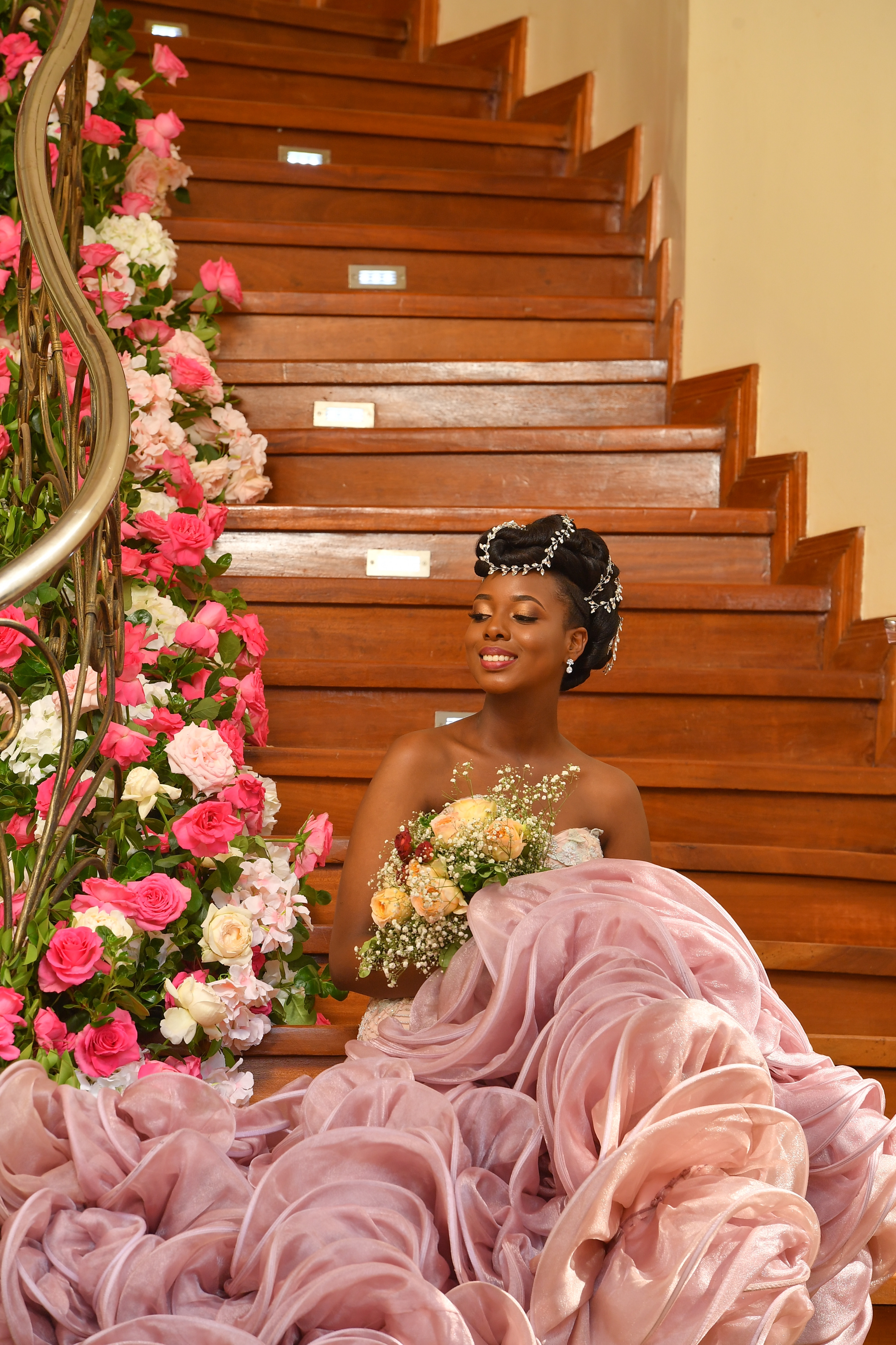
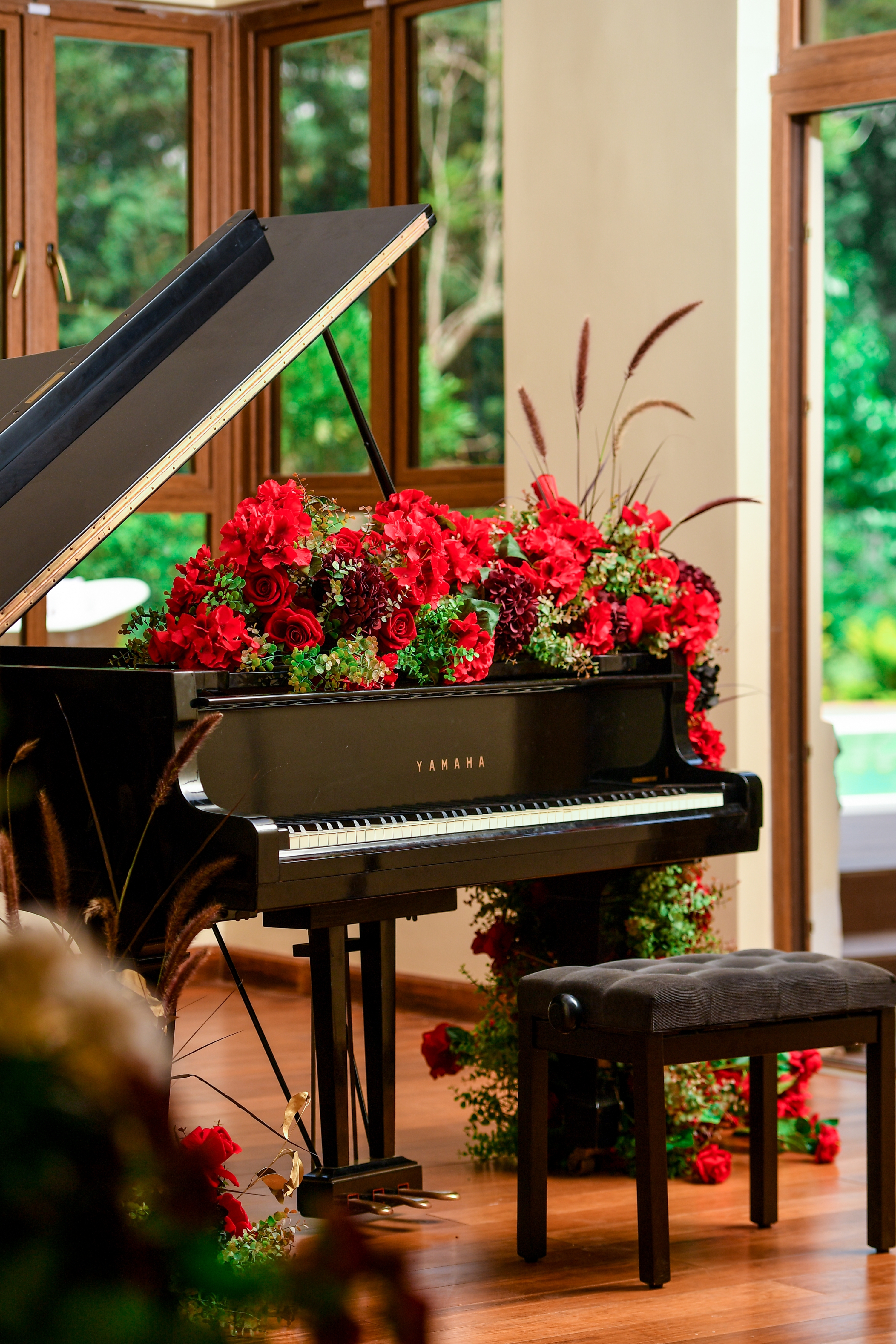
Flower arrangement by @flowerartkenya https://www.instagram.com/floralartkenya/


